Whimsy without sacrificing trust
Soft, playful, organic interfaces can read childish or premium. The difference is a hundred small choices.
Pastel palettes, rounded shapes, and a sense of motion can take a brand to two very different places: kindergarten poster, or premium studio. Both are using the same vocabulary; the difference is in the dialect.
The signals that move it toward "premium": warm rather than cool palette, generous spacing, a single editorial accent (italic serif, used sparingly), motion that is slow and deliberate, type weight that does not bounce.
The signals that pull it back to "childish": multiple bright primary colors, dense layout, motion that is fast and bouncy, every element shouting at once.
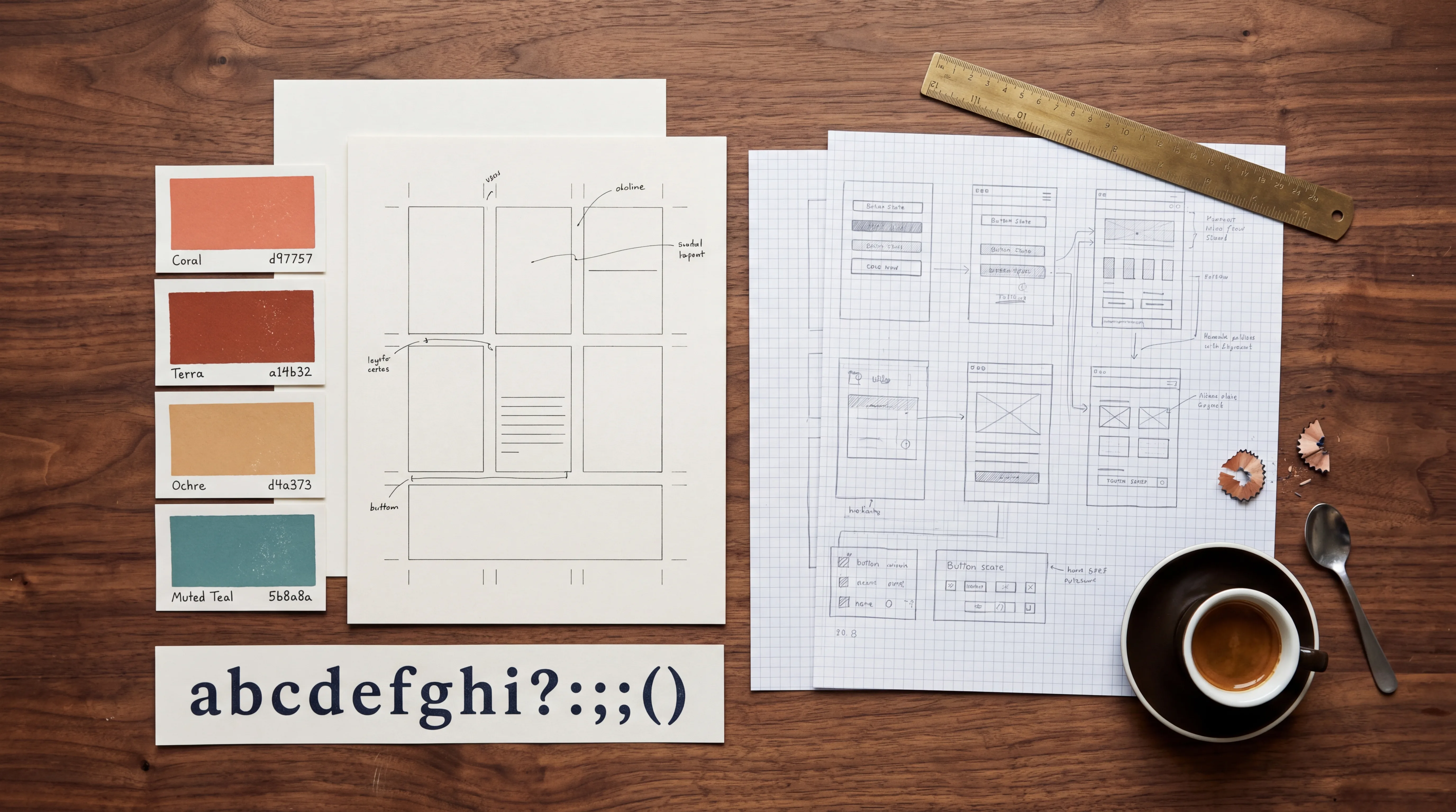
For techpotions, we picked the warm direction explicitly. Cream and peach backgrounds, coral and terra brand inks, Inter Display with Instrument Serif italic for occasional accents — and motion that breathes rather than dances.